How to commission usability testing for a digital product

- 1. Write down the decision before you ask for proposals
- 2. Match the method to the question
- 3. Read the recruitment criteria before the sample size
- 4. Review one task and its success criteria in advance
- 5. Where synthetic personas fit in usability research
- 6. Ask to see a finding your designer could act on
- How this informed VOYA’s work with Neova Insurance
- Six questions to ask a usability testing partner
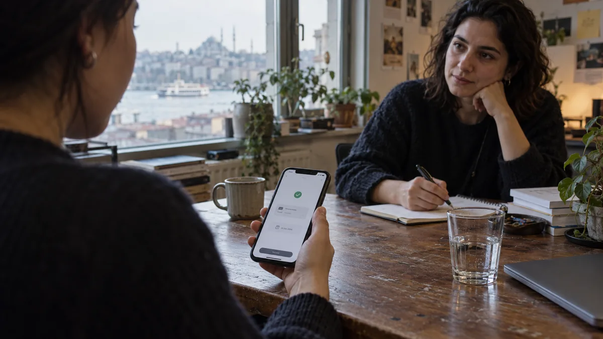
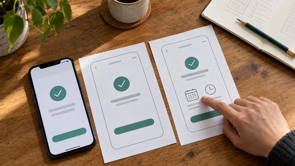
A customer schedules a payment, sees a green check mark and closes the app. Your analytics record a completed transaction. But does the customer know the money will move on the date they selected? Or do they believe their landlord has already been paid? Those two experiences produce the same event in your dashboard.
Usability testing means watching people who use, or are likely to use, a product attempt a realistic task. It can reveal the gap between what a system records and what a person believes just happened. When commissioning a usability study, start with the decision you need to make. The screen count and session plan can follow. GOV.UK guide to moderated usability testing
1. Write down the decision before you ask for proposals
Imagine a fintech team preparing to launch scheduled payments. The team can ship the current confirmation screen or revise it to give the payment date and status more prominence. A research question that helps them choose is: “After scheduling a payment for the first time, can customers explain when the money will leave their account?”
That question gives the study a boundary. Whether someone likes the home screen has little bearing on the release decision. Whether they set up a second transfer because they misunderstood the first confirmation has a great deal. If your team has several journeys to investigate, weigh how often people use each one, the consequences of an error and how soon you can act on the findings.
2. Match the method to the question
| What the team needs to know | Suitable approach | What it contributes |
|---|---|---|
| How do first-time users interpret the payment date? | Moderated testing with an interactive prototype | A researcher can observe hesitation and ask what the participant expected at that moment. |
| Can people complete a well-defined task independently? | An unmoderated task study with piloted instructions | Participants receive consistent instructions. A recording or follow-up question can help explain an unexpected outcome. |
| Which of two live screens reduces duplicate transfers? | An A/B test with sufficient traffic and an appropriate experiment design | The team can compare a predefined outcome across versions. |
A prototype only needs to support the behaviours the study will examine. For our payment example, that might include choosing a date, scheduling the transfer and finding its status afterwards. If the question is whether someone can use the date picker with a screen reader, ask the research partner to demonstrate that the test build supports that interaction.
3. Read the recruitment criteria before the sample size
“Mobile banking customers aged 25–45” is easy to specify, but tells you little about payment habits. Someone who schedules bills every month brings different expectations from someone who always pays immediately. A useful screening question is “How did you arrange for a bill to be paid on a later date in the past three months?” The answer helps a recruiter distinguish experience from stated willingness to try a feature.
Ask the supplier to explain who they will recruit, how they will recognise each group and why the proposed numbers fit your decision. A small first round can uncover problems in one journey. Estimating a completion rate or comparing two customer segments requires a different sampling plan. If three participants misunderstand a confirmation, report what happened in those sessions. A population-wide failure rate would require further evidence. GOV.UK usability benchmarking guide
4. Review one task and its success criteria in advance
“Open Scheduled Payments, choose a date and tap Confirm” gives away the route you want to evaluate. Give the participant a situation and an outcome they care about instead:
Today is the 10th. You’ll be away on Friday and want your rent to reach your landlord on the 15th. Use the app to take care of it before you leave. Let me know when you’re finished.
When the participant stops, ask “What has happened in your account so far? What do you expect to happen next?” A leading question such as “The money hasn’t moved yet, has it?” would make it impossible to tell whether the interface conveyed that distinction.
Score two outcomes separately. Did the person schedule the correct date? Could they explain the payment status? Record any help the moderator provided. This lets the team distinguish a date picker that works well from a confirmation message that causes confusion. Sample account and recipient details make the task workable without asking anyone to share personal banking information.
5. Where synthetic personas fit in usability research
A synthetic persona is a representation of a user profile generated or enacted by an AI model using a description of its goals, prior experience and circumstances. “Uses mobile banking weekly but has never scheduled a transfer” describes a profile. Asking a model to interpret a task in that role produces a simulation. Record which parts of the profile come from earlier research and which are assumptions. That distinction matters when deciding what weight to give an answer. IEEE systematic review of synthetic users in human-centred design
Consider how a researcher might use two profiles to review the rent scenario. One usually pays immediately. The other sets up recurring payments. The model might flag that paying rent sounds like a monthly commitment. This gives the researcher something specific to check. If the product decision concerns a one-off transfer, they can clarify the scenario and pilot the revised wording with a person.
Keep three types of evidence distinct. The following examples are illustrative:
| Record | Example | Appropriate use |
|---|---|---|
| Synthetic hypothesis | The rent scenario might suggest a recurring payment. | Review the wording and plan a pilot question. |
| Pilot observation | A participant asked whether the task included next month’s rent. | Clarify the instruction before the main sessions. |
| Product finding | With the revised task, some participants scheduled the transfer correctly but said the money had already moved. | Revise the confirmation and test comprehension again. |
Generating a hundred responses tells you what a model produced under those instructions. It cannot tell you how a hundred customers would behave on their own devices. Keep synthetic statements out of participant quotations and simulated profiles out of recruitment totals. When a proposal offers “AI-powered user testing”, ask the supplier to identify exactly where AI enters the workflow and which conclusions will be grounded in observed human behaviour.
6. Ask to see a finding your designer could act on
“Improve the confirmation screen” leaves most of the research work to the designer. An actionable finding preserves enough evidence for a colleague who missed the session to question the interpretation and propose a solution.
| Field | Illustrative finding |
|---|---|
| Task and observation | The participant chose the intended date. When asked what had happened, they said the recipient had received the money. |
| Interpretation | The check mark may communicate that the transfer has settled as soon as the instruction is accepted. |
| Impact | A customer could act on an incorrect account status. The team may decide to address this before release. |
| Design change to test | Use “Payment scheduled for 15 November” as the heading and make the pending instruction easy to find afterwards. |
| Retest question | Can new participants explain the status and date without a prompt from the moderator? |
In the actual report, look for session references, excerpts where consent allows and cases that contradict the interpretation. A rare issue can still deserve attention when the consequences are serious. And a participant’s preferred fix is worth recording separately from the change your team eventually decides to test.
How this informed VOYA’s work with Neova Insurance
In our work on Neova’s mobile insurance app, we used user testing and heatmaps to investigate points of hesitation in the purchase journey. The findings informed specific changes to the home screen hierarchy, product cards, quotation steps and navigation. When reviewing a supplier’s case study, look for that connection between the behaviour they investigated and the part of the product their team changed. VOYA’s Neova Insurance case study
Six questions to ask a usability testing partner
- Which product decision will this study support, and which journeys can we leave out?
- How will you screen for relevant experience? Are recruitment and incentives included in the fee?
- Can we review the tasks and success criteria before the sessions?
- If you use synthetic personas, what informs them and how will you distinguish their outputs from participant evidence?
- Can we see an anonymised finding? Who can access recordings, and for how long?
- Does the quote cover a findings workshop, a design revision and a second round with fresh participants?
When comparing fees, check recruitment difficulty, device coverage, prototype preparation and the scope of the retest. Ten sessions followed by a presentation buy a different outcome from a project that includes revising a design and testing it again. With a fixed budget, narrowing the study to one release-critical journey can leave room to find out whether the change actually helps.
If you’re discussing a usability study with VOYA, bring one customer task, one signal that something is going wrong and one decision your team faces. “Customers schedule the payment successfully, but support still hears ‘Has my money gone through?’ We need to decide whether the new confirmation is ready to ship.” That is enough to start designing a worthwhile study.


Explore All Blogs



















Ready to talk
about your project?
Do you have a clear vision regarding the ideas, goals, requirements, and desired outcomes for your project? Let's take the first step together by setting up a meeting to bring all of these to life.