AI in Banking and Customer Trust: What Evidence from Türkiye Means for Product Design


- What research from Türkiye tells us
- Assess trust in relation to the outcome
- Give explanations that support decisions
- Design uncertainty as carefully as success
- Make customer control practical
- Test understanding, not just stated confidence
- Turning trust into product decisions with VOYA
- Frequently asked questions
- How can banks build trust in AI?
- Does the Türkiye research measure trust in banking AI?
- Does every AI feature need human confirmation?
When someone opens a banking app to understand an unfamiliar transaction, the model behind the assistant is rarely their first concern. They want a reliable answer. If the app offers a recommendation, they need to understand its basis. If it prepares an action, they need to know what will change in their account. Trust in banking AI develops through these practical interactions.
AI can help people navigate financial information, reduce repetitive work and find relevant answers. In a financial product, however, convenience needs to be accompanied by a clear understanding of the system’s limits. Users should be able to distinguish a suggestion from a confirmed transaction.
At VOYA, we approach trust as a quality that can be explored through product design and user research. The interface, the underlying operation and the controls available to the customer need to tell the same story.
What research from Türkiye tells us
The Türkiye snapshot of KPMG and the University of Melbourne’s 2025 study reports that 92% of respondents expect benefits from AI, while 56% are willing to trust it. These are attitudes toward AI generally, rather than a banking-specific measure.
Our product design interpretation is that perceived usefulness and willingness to rely on a system deserve separate investigation. Accepting a suggested spending category is different from accepting an explanation of a lending decision. A single trust question cannot adequately describe every financial use case.
This research provides context, rather than a forecast for a particular bank. Product teams still need to study their own customers, tasks and consequences. The reported percentages should not become adoption targets or conversion assumptions for an individual feature.
Assess trust in relation to the outcome
Potential applications include explaining account activity, locating a transaction or helping customers understand which documents an application requires. Even these informational functions need reliable sources and clear boundaries.
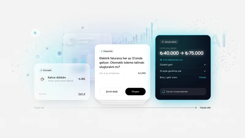
An assistant that prepares a payment introduces a different level of consequence. Selecting the wrong recipient matters differently from mislabelling a purchase. Teams should consider the impact of an error, how users could notice it and what recovery would involve.
Consider a proposed interaction: a customer asks the assistant to prepare their usual rent payment. The product might use past activity to create a draft, but the recipient, amount, funding account and execution date should remain visible before confirmation. Preparing a payment and executing it must be separate, understandable states. This is an illustrative design scenario, not a claim about a deployed bank feature.
Give explanations that support decisions
“Recommended for you” signals personalisation without explaining its basis. A customer cannot judge the relevance of a recommendation if they do not know which information informed it.
For a spending summary, a short explanation might say that the analysis covers three months of activity in the selected account and excludes accounts elsewhere. This helps customers understand both the evidence and the missing context. It also reduces the chance that they will assume the assistant has a complete picture of their finances.
Useful transparency does not require a technical account of model architecture on every screen. A layered explanation can present the essential information first, with data scope and update details available when needed. The layers should help people understand the decision rather than hide its limitations.
The explanation itself must be grounded. A plausible narrative generated after a decision may not describe the factors that actually produced it. Design teams should work with technical and operational colleagues to determine which reasons can be reliably shown.
Design uncertainty as carefully as success
“Checking”, “Pending” and “Completed” communicate different operational states. Treating them as interchangeable can leave a customer with an incorrect understanding of what happened to their money.
If the system cannot verify a transfer result, the interface should describe that uncertainty and provide a dependable way to check. A proposed message might direct the user to transaction history before attempting another payment. The exact wording must reflect the product’s real capabilities and operational rules.
These situations belong in the main design process. Prototypes should include timeouts, missing information, conflicting responses and interrupted sessions. Each state needs an appropriate next step: continue, seek support or stop safely. A polished success screen cannot compensate for an ambiguous failure state.
Make customer control practical
Control involves more than adding a confirmation checkbox. Users need to inspect, edit or cancel a proposed action and understand its consequences. Repetitive, vague confirmations can make careful review harder, so confirmation should be proportional to the action.
In an AI-supported spending plan, customers should be able to correct an inaccurate category. They should also understand whether that correction affects only the current summary or future recommendations. If personalisation can be disabled, the resulting changes should be explained before the customer chooses.
Access to human support is another control. Customers should understand why a case is being transferred, what information will accompany it and how they can follow its progress. An escalation option that exists but is difficult to find offers limited practical value.
Test understanding, not just stated confidence
Asking whether a participant trusts an assistant is useful, but insufficient. Task-based research reveals whether people locate the basis of a recommendation, notice incomplete information and review the details of a consequential action.
Recruitment can include different levels of financial confidence and accessibility needs. Low-consequence tasks and consequential decisions should be evaluated separately. This helps teams understand where the design works and where additional support is necessary.
Useful measures include task completion, misunderstanding, incorrect confirmation and demand for assistance. The aim is appropriate reliance. A participant who challenges an uncertain recommendation may be demonstrating a successful understanding of the system’s limits.
Turning trust into product decisions with VOYA
As a UX studio, VOYA helps translate customer needs into product structure, interaction design and testable prototypes. For AI-enabled financial products, that means considering scope, explanations, confirmation, uncertainty and recovery together.
Our AI product transformation approach starts with the work people need to accomplish. Deciding which tasks AI can simplify is closely connected to deciding which choices should remain visible and under customer control.
For the privacy dimension, read AI and Türkiye’s KVKK framework. For support operations, continue with AI assistants in banking.
Frequently asked questions
How can banks build trust in AI?
Make the system’s scope understandable, show verified transaction states, provide meaningful control over consequential actions and design a clear route to recovery. Test whether customers understand these mechanisms.
Does the Türkiye research measure trust in banking AI?
The study used here measures general attitudes toward AI. Its findings should not be presented as banking-specific evidence or as a prediction for an individual financial product.
Does every AI feature need human confirmation?
From a design perspective, confirmation should reflect consequence and reversibility. Summarising information and executing a payment require different controls, alongside any applicable legal and operational requirements.


Explore All Blogs




































Ready to talk
about your project?
Do you have a clear vision regarding the ideas, goals, requirements, and desired outcomes for your project? Let's take the first step together by setting up a meeting to bring all of these to life.