Investigating Drop Off in Fintech Onboarding

- Define the application funnel first
- Separate possible causes of drop off
- Give questions and errors a clear purpose
- Support review before submission and clarity afterwards
- Frequently asked questions
- Is a shorter journey always better
- Is submission rate enough to measure improvement
- Where should design work begin
- Sources
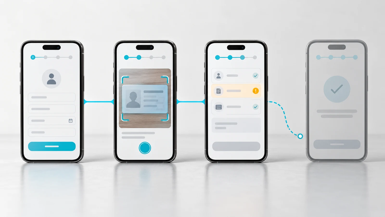
When people leave a fintech application, the first question should not be which screen to redesign. Establish where progress stops, who encounters the problem and what conditions surround it. Identity checks, unclear questions, technical failures and waiting for a decision are different problems that require different responses.
The design goal is to help people understand and complete necessary steps. Required checks, data retention and verification obligations should be established with the relevant legal, compliance and security teams. Improving usability does not mean bypassing those controls.
Define the application funnel first
Distinguish the start of an application from its completion. Account creation, application submission and account approval are separate outcomes. GOV.UK's completion rate guidance also stresses the importance of defining start and end points.[1] Adapt those definitions to your own product and process.
Examine transitions by meaningful segments such as device, operating system, application type and new versus returning applicants. Leaving a page does not necessarily mean abandoning the application. Someone may be finding a document or continuing on another device. Define how returning sessions and the completion window will be handled.
Separate possible causes of drop off
| Possible problem | Signal to investigate | Improvement to test |
|---|---|---|
| Unclear data request | Help use and support questions | Explain why the information is needed |
| Failed document upload | Error codes and repeated attempts | Guidance on accepted format and quality |
| Uncertain status | Duplicate submissions and repeated checks | Clear status and next action |
| Interrupted application | Returning users start again | A suitable and secure resume journey |
| Difficult correction | Repeated errors in the same field | Field specific feedback and easy editing |
These signals generate hypotheses; they do not prove the cause. Combine technical records with interviews and task observations. Camera permissions or service failures, for example, may need engineering changes as well as clearer interface content.
Give questions and errors a clear purpose
Explain the reason for requesting information where that explanation is useful. GOV.UK's question page pattern encourages teams to examine why each question is needed and provide appropriate context.[2] Apply this to unnecessary repetition while preserving required checks.
Replace an unhelpful “transaction failed” message with an accurate next action. If a document image cannot be read, explain suitable capture conditions. If a service is unavailable, clarify whether retrying is safe and whether progress has been saved. These messages must match the system's actual behaviour.
Support review before submission and clarity afterwards
A review step can help applicants check and correct important information. GOV.UK's check answers pattern is designed for that purpose.[3] After editing, people should be able to return to the review stage without restarting the journey.
After submission, distinguish received, under review, more information required and completed states according to the real process. Avoid promising an unverified decision time. Explain what happens next, how the applicant will be contacted and whether they need to act.
Frequently asked questions
Is a shorter journey always better
No. Questions must be understandable and completed accurately. Step count alone is a poor measure of success.
Is submission rate enough to measure improvement
Review it alongside errors, retries, support demand and downstream verification outcomes. More submissions do not necessarily mean more valid applications.
Where should design work begin
Start with an important step showing meaningful loss and gather evidence around it. Explore VOYA UI UX design services to review the customer experience of that journey.
Sources


Explore All Blogs





























Ready to talk
about your project?
Do you have a clear vision regarding the ideas, goals, requirements, and desired outcomes for your project? Let's take the first step together by setting up a meeting to bring all of these to life.