Color Psychology in UI Design: How Does It Influence User Decisions?

- Colors and Human Psychology: First Impressions and Decision-Making Process
- The Role of Warm and Cool Colors in Decision-Making
- Warm Colors: Urgency, Attention-Grabbing, and Sincerity
- Cool Colors: Trust and Calmness
- Enhancing User Experience with Color Psychology
- Color Harmony and Emotional Responses
- The Role of Colors in Decision-Making
- Using Color Palettes in UI Design: Strategy and Emotional Balance
- Transform the Experience with VOYA
UI (user interface) design is based on creating simple, consistent and easily understandable interfaces. Two key elements of user interfaces stand out: typography and color palette. Just as choosing easily readable fonts is essential, selecting colors that align with the design’s essence is equally important. Colors are not only crucial for aesthetics but also play a significant role in enhancing user experience and influencing user decisions. In this article, you will find detailed insights into color psychology in UI design.
Colors and Human Psychology: First Impressions and Decision-Making Process
Colors influence humans emotions and decision-making. Studies show that people form an opinion about a person, environment, or product within the first 90 seconds, with up to 90% of this judgment based solely on color. Additionally, colors can increase brand recognition by up to 80%.
Colors influence humans emotions and decision-making. Studies show that people form an opinion about a person, environment, or product within the first 90 seconds, with up to 90% of this judgment based solely on color. Additionally, colors can increase brand recognition by up to 80%.
This psychological impact makes colors a crucial element in user interface (UI) design. Color psychology is based on how the human brain processes colors. Light moves in waves and each color has a different wavelength. These varying wavelengths interact with the eye differently and leading to diverse effects on people.
The Role of Warm and Cool Colors in Decision-Making
Colors are generally categorized into two groups: warm and cool colors. Colors that have long wavelengths and emit high energy such as red, orange and yellow are considered warm colors. Colors known for their calming effects such as blue, purple and green are classified as cool colors.
Warm Colors: Urgency, Attention-Grabbing, and Sincerity
Red: Red is often associated with passion and known for attention-grabbing quality. It creates a sense of urgency and making this color ideal for promoting sales and discounts. Because of its association with danger, red is commonly used for warning or "reject" buttons.
Yellow: Yellow is the brightest color in the spectrum, it evokes energy and optimism. It inspires creativity and innovation, making it useful for highlighting product features.
Orange: Representing optimism and joy, orange is particularly popular among children and is frequently used in kid-friendly designs. Among warm colors, it best conveys a sense of sincerity, making it suitable for designs that emphasize warmth and approachability.
Cool Colors: Trust and Calmness
Blue: A favorite among both men and women, blue symbolizes trust and calmness. It represents honesty, which is why many corporate brands prefer this color. It is commonly used in industries where reliability is key such as healthcare and finance.
Purple: Historically associated with royalty due to its rarity, purple carries a sense of mystery and creativity. It is often used in niche industries to evoke a sense of exclusivity.
Green: Strongly linked to nature and health, green is also associated with wealth when used in darker shades. It is widely used in organic products, eco-friendly branding, and health- related designs.
Enhancing User Experience with Color Psychology
To improve user experience, multiple colors should be combined in the right proportions, effectively capturing the user's attention while maintaining consistency throughout the interface. Choosing the right color palette is crucial in achieving this balance.
Color Harmony and Emotional Responses
The process begins by determining which colors work well together. Designers can establish color harmony independently or draw inspiration from existing, successful combinations. Understanding why a particular palette is chosen helps make informed adjustments. For example, in a palette based on the contrast between warm and cool colors, red (a warm color) could be replaced with yellow or orange to create a new variation.
Color harmony does more than create an aesthetically pleasing design—it also influences user experience. A design featuring warm colors, for instance, encourages engagement and action, while cool colors foster a calming and trustworthy atmosphere. Ensuring color harmony helps users navigate the interface smoothly and reinforces the intended emotional impact.
The Role of Colors in Decision-Making
Understanding how colors guide user decisions is essential in UI design. For example:
- Red buttons signal urgency, prompting users to take immediate action. Blue buttons, on the other hand, appeal to users seeking reassurance and trust.
- Green is associated with approval and success, making it a common choice for confirmation messages or success notifications.
- Attention-grabbing colors like yellow and orange are effective for drawing user attention to important actions, such as warnings or key information.
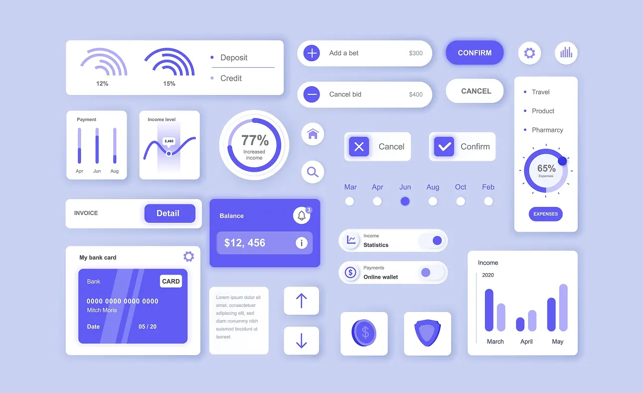
Using Color Palettes in UI Design: Strategy and Emotional Balance
After establising an effective color palette, the next step is applying it strategically within the design. This phase bridges theory and practice, requiring attention to key principles.
- The 60-30-10 Rule: This rule dictates how colors should be distributed within a design. In a three-color scheme, the primary color should cover 60%, the secondary color 30%, and the accent color 10%. This structure helps maintain visual hierarchy and balance contrast effectively. While the primary and secondary colors are often neutral or subtle, the accent color is typically more vibrant to create emphasis.
- Consistency: A UI design should remain visually cohesive to avoid confusion. A color used for a button in one section should serve the same function across all interfaces. For example, green for confirmation and red for rejection should be consistently applied throughout the design. This uniformity enhances usability by making interactions predictable and reducing cognitive load.
Transform the Experience with VOYA
At VOYA, we offer a wide range of services from MVP product design to UX audits and research, development services to SaaS design, tailored to every brand and product's needs. Through our UX audit service, we help create experiences that enhance user loyalty, address their needs and meet their expectations. To better understand your users and create successful digital products, you can schedule a meeting with us today!
Explore All Blogs


Ready to talk
about your project?
Do you have a clear vision regarding the ideas, goals, requirements, and desired outcomes for your project? Let's take the first step together by setting up a meeting to bring all of these to life.