Neova Sigorta
From Discovery to Purchase: A Stronger Insurance Experience
We redesigned the Neova Insurance mobile app to make it easier for users to explore products, get quotes, and complete their purchase with confidence.
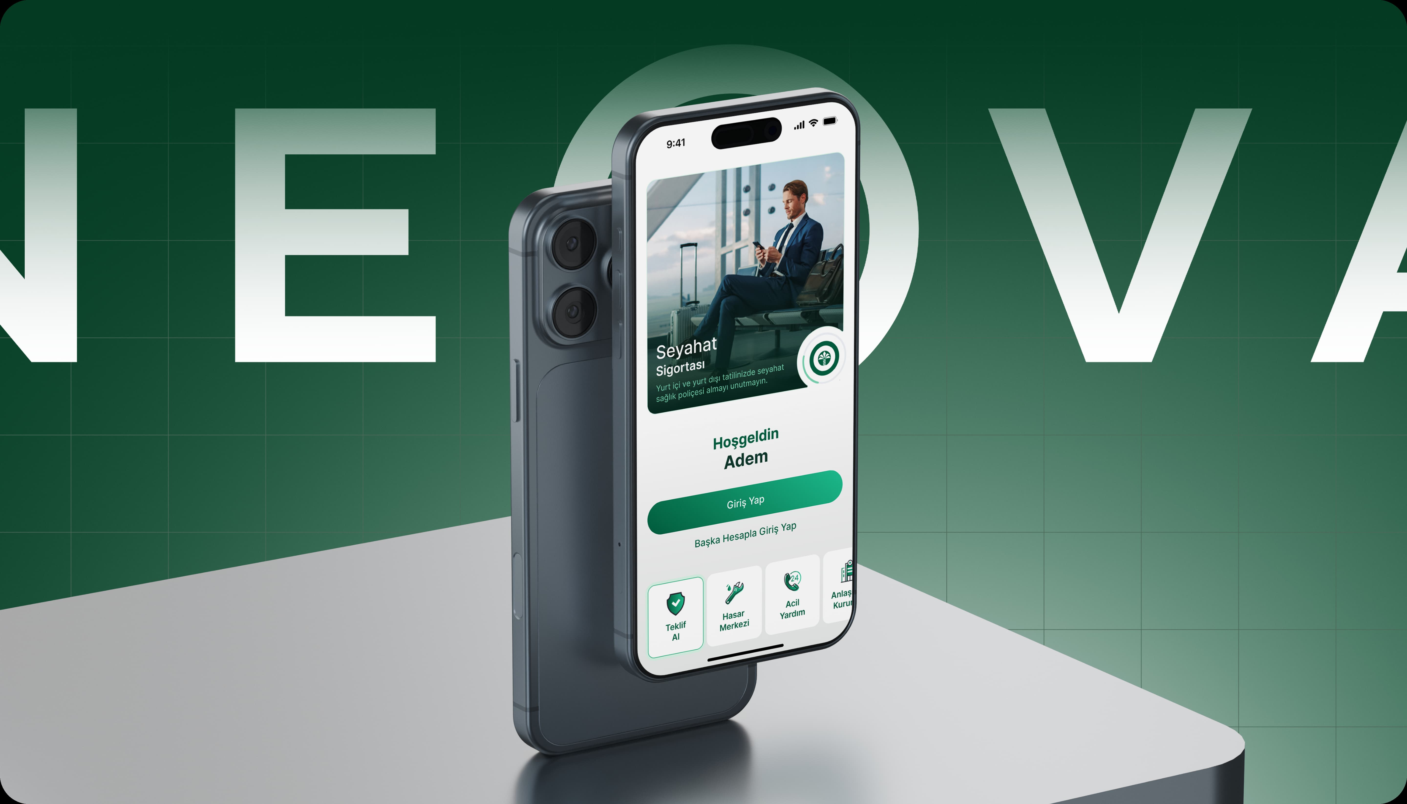
Project Idea
The Neova Insurance mobile app was built to give users quick access to insurance products to easily review offers personalized and complete the purchasing steps in a clearer manner.
At VOYA, we redesigned not just the interface, but the entire experience, information architecture, product discovery experience, and the purchasing journey from end to end.
In a field like insurance, where decision-making is challenging and trust is essential, we designed a simple and guiding mobile experience that ensures users see the information they need at the right moment.
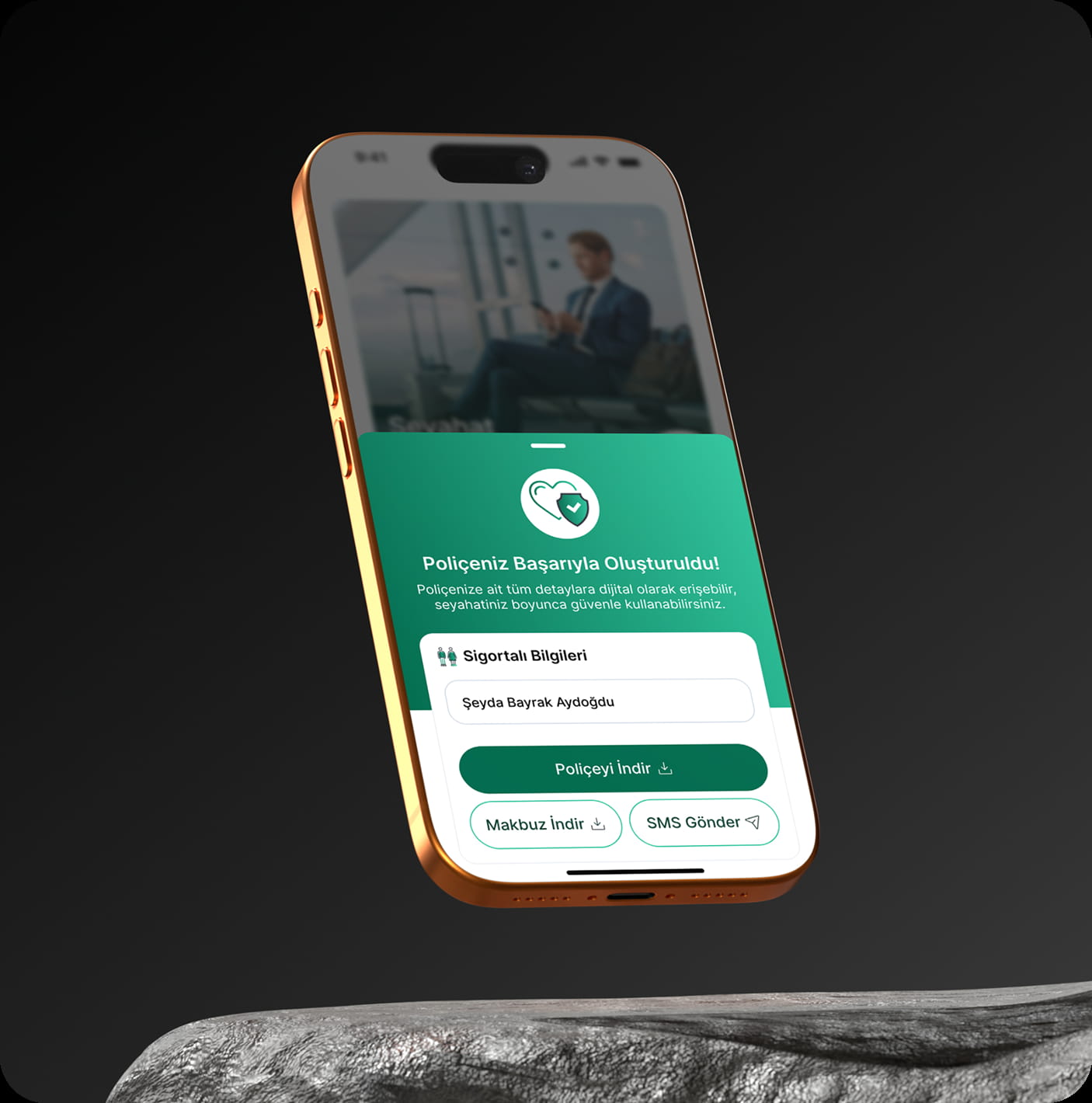
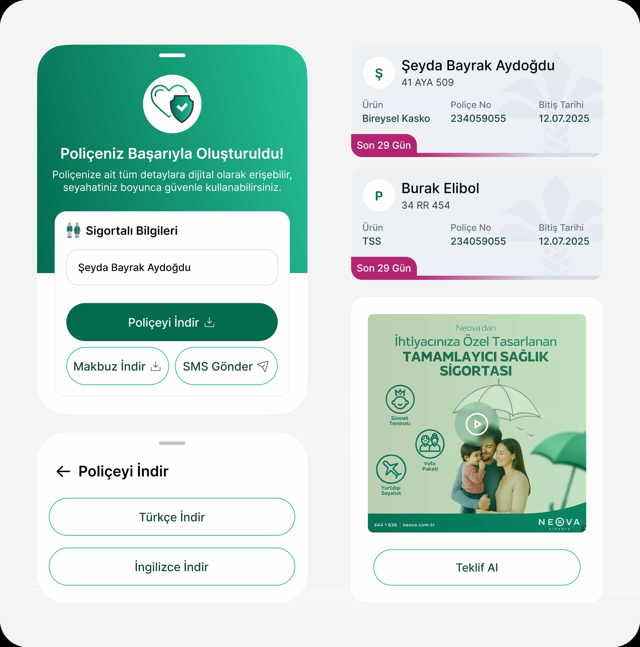
Project Scope
The user experience, information architecture, and interface design of the Neova Insurance mobile application were re-evaluated within the scope of the project. The aim was to make insurance products more understandable, facilitate users' access to the right product according to their needs, and reduce friction in the purchasing process.
We analyzed the existing mobile experience, studied user behavior, and identified key friction points in the purchase flow. Based on these insights, we restructured key areas including onboarding, homepage, product discovery, quoting, policy details, and checkout.
In the design process, while staying true to Neova’s brand language, we created a simpler, more reassuring interface that is better aligned with mobile usage patterns.
Research
User needs analysis
Industry operation analysis
Data analysis & insight extraction
UX Design
Flows & information architecture
Wireframe & prototypes
Solution proposals
UI Design
Visual Language & Brand Reflection
UI screens & interactions
UI Kit
Launch and Follow-up
Developer handoff
QA & Design consistency
Consistency & quality control
Research
User needs analysis
Industry operation analysis
Data analysis & insight extraction
UX Design
Flows & information architecture
Wireframe & prototypes
Solution proposals
UI Design
Visual Language & Brand Reflection
UI screens & interactions
UI Kit
Launch and Follow-up
Developer handoff
QA & Design consistency
Consistency & quality control
A Smoother Experience, A Stronger User Impact*A Smoother Experience, AStronger User Impact*
A more understandableproduct discovery experience
A more understandableproduct discovery experience
Higher conversion ratesin purchase flows
Higher conversion ratesin purchase flows
Reduced drop-offat critical steps
Reduced drop-offat critical steps
Higher engagementin the quoting flow
Higher engagementin the quoting flow
Represents the experience improvement indicators determined by rates, user tests, and UX analyses.
Represents the experience improvement indicators determined byrates, user tests, and UX analyses.
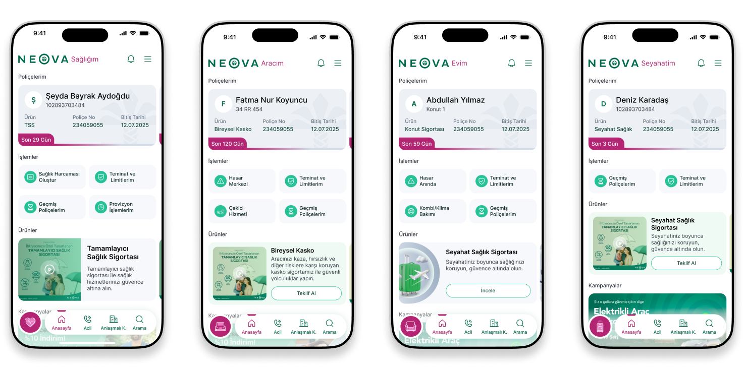
We redesigned, we restructured the Neova Insurance mobile application end-to-end, including claims management, assistance services, policy viewing, coverage and limit tracking, user profiles, and quick action flows.
In the UX design process, we designed a mobile insurance experience that simplifies complex insurance transactions, allowing users to make faster decisions when needed, create a claim without logging in, call for emergency assistance, and easily access accident reports.
Using a data-driven approach, we analyzed user behavior, transaction times, and service usage to continuously improve the experience. As a result, the app evolved from a transactional tool into a more dynamic, user-focused digital insurance product.
On the UI side, we reorganized information-heavy screens with a simpler, clearer, and more reassuring design language. As a result, we created a powerful mobile application experience for Neova Insurance, where users can effortlessly access critical services, take quick actions, and progress more smoothly.
User Testing & Heatmap Analysis
We utilised user testing and heatmap analysis to understand the key pain points users face in the mobile insurance experience. These insights revealed where users lost attention, hesitated, and dropped off during the purchase journey.
Based on the findings, the homepage hierarchy, product cards, quote steps, and navigation areas were redesigned. A more visible and action-oriented experience was created, enabling users to access the information they need more quickly.
As a result, the Neova Insurance mobile app evolved into a more intuitive and user-focused product, with a refreshed interface and a stronger overall experience aligned with user behavior.
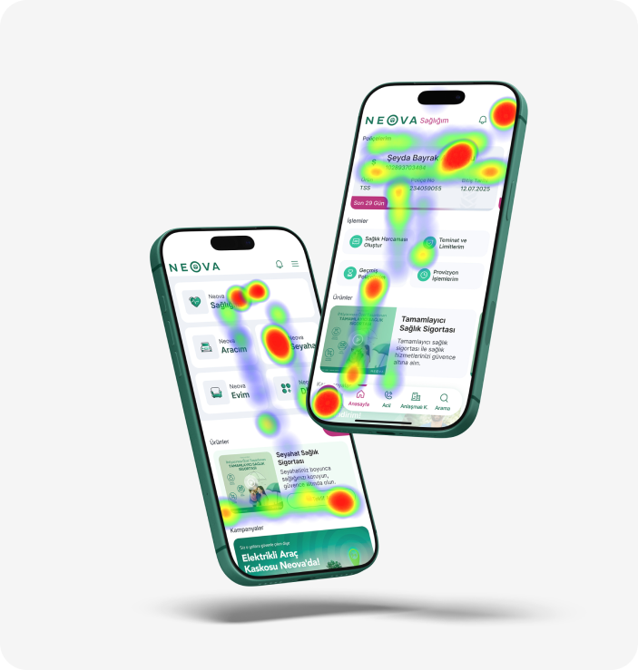
We examined users' focal points and interaction intensities within the application through heatmap analysis. This data helped us identify which areas needed to be made more visible and which flows needed to be simplified.
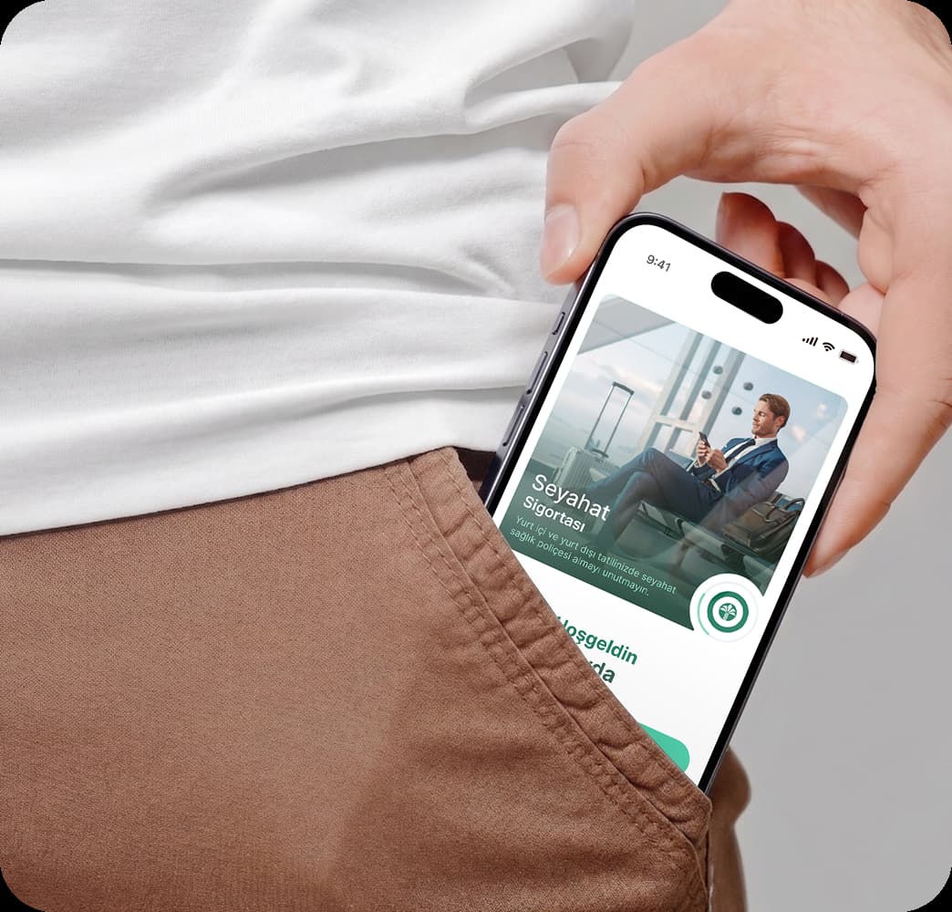

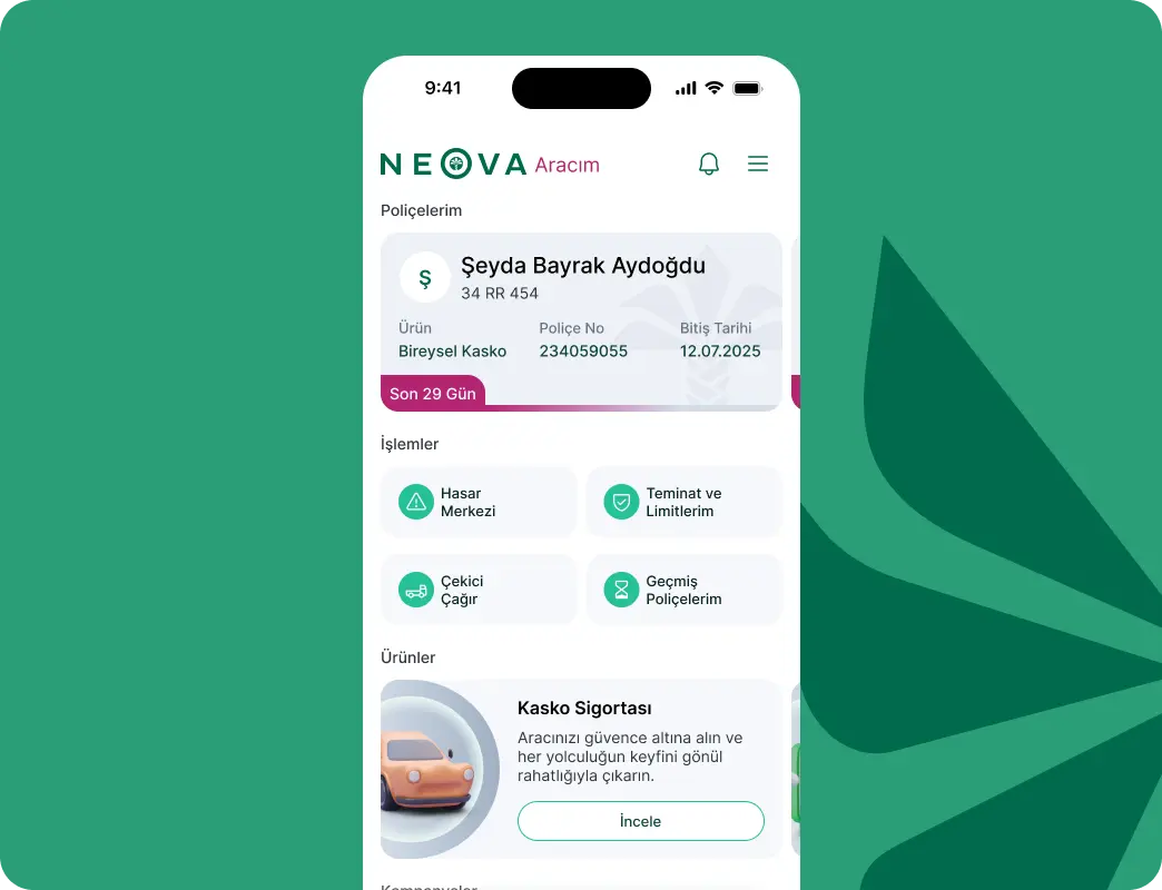
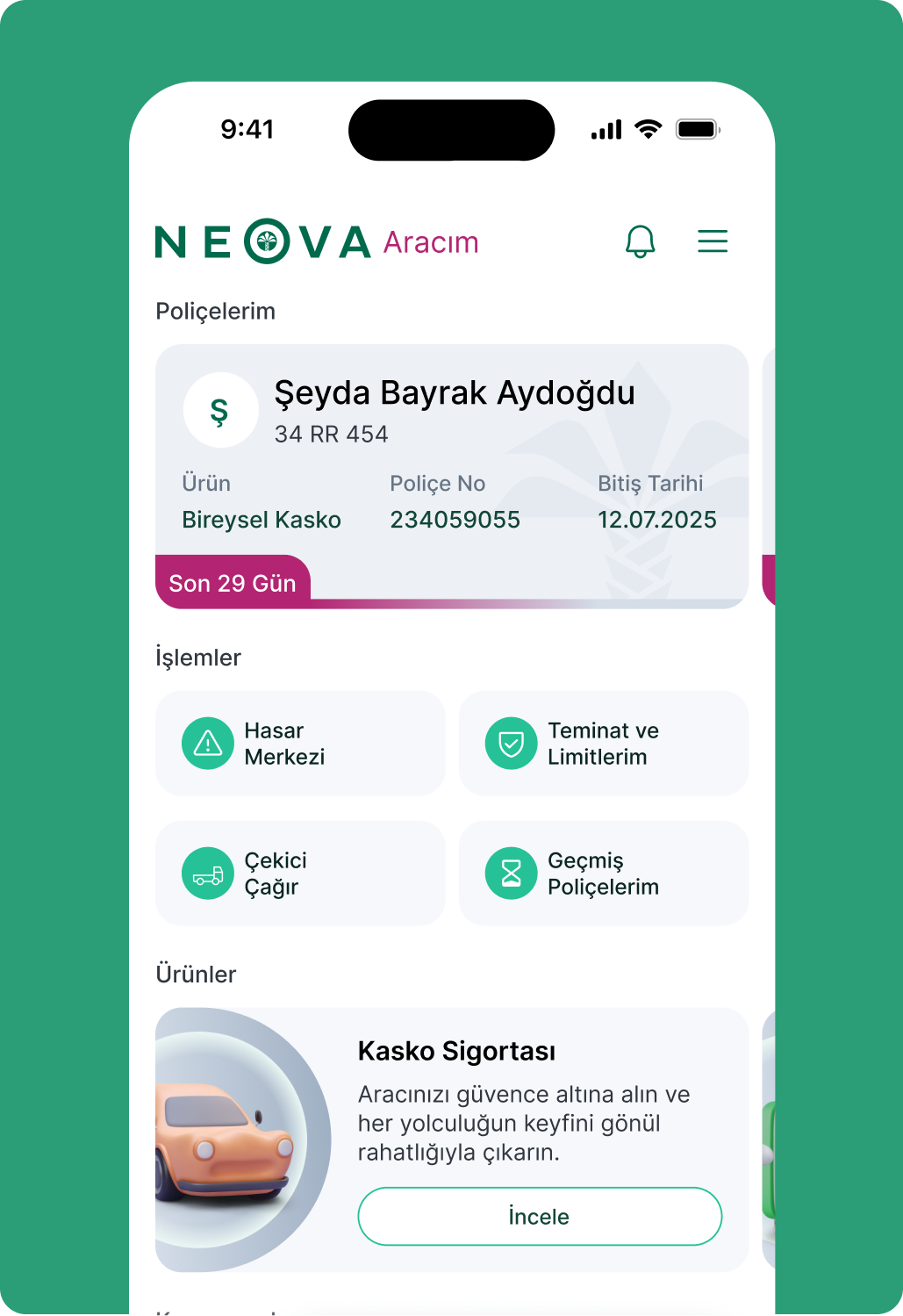

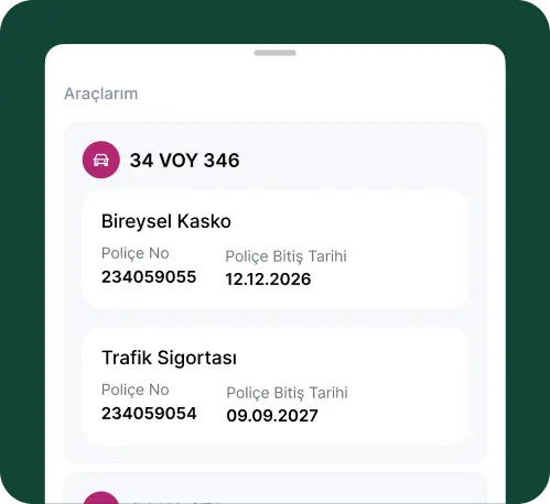
We ensured all modules work effectively both individually and together, providing a seamless experience.
By simplifying data-heavy screens with a clear, comprehensible, and reassuring design language, we created a scalable structure.
Typography and Color
We refined Neova Insurance’s digital brand experience by rethinking typography, colour, and interface components with a mobile-first approach. While staying true to the brand’s trusted identity, we introduced a more modern, readable, and consistent visual system.
We simplified the colour palette to reinforce trust and clarity, and optimised typography for better readability on mobile. This helped reduce visual density and made it easier for users to understand information and make decisions.
Products That Make You Smilewith Neova Sigorta
Products That Make You Smile withNeova Sigorta
Products That Make You Smilewith Neova Sigorta
Products That Make You Smile withNeova Sigorta
Products That Make You Smilewith Neova Sigorta
Products That Make You Smile withNeova Sigorta

Experience That Converts on First Contact
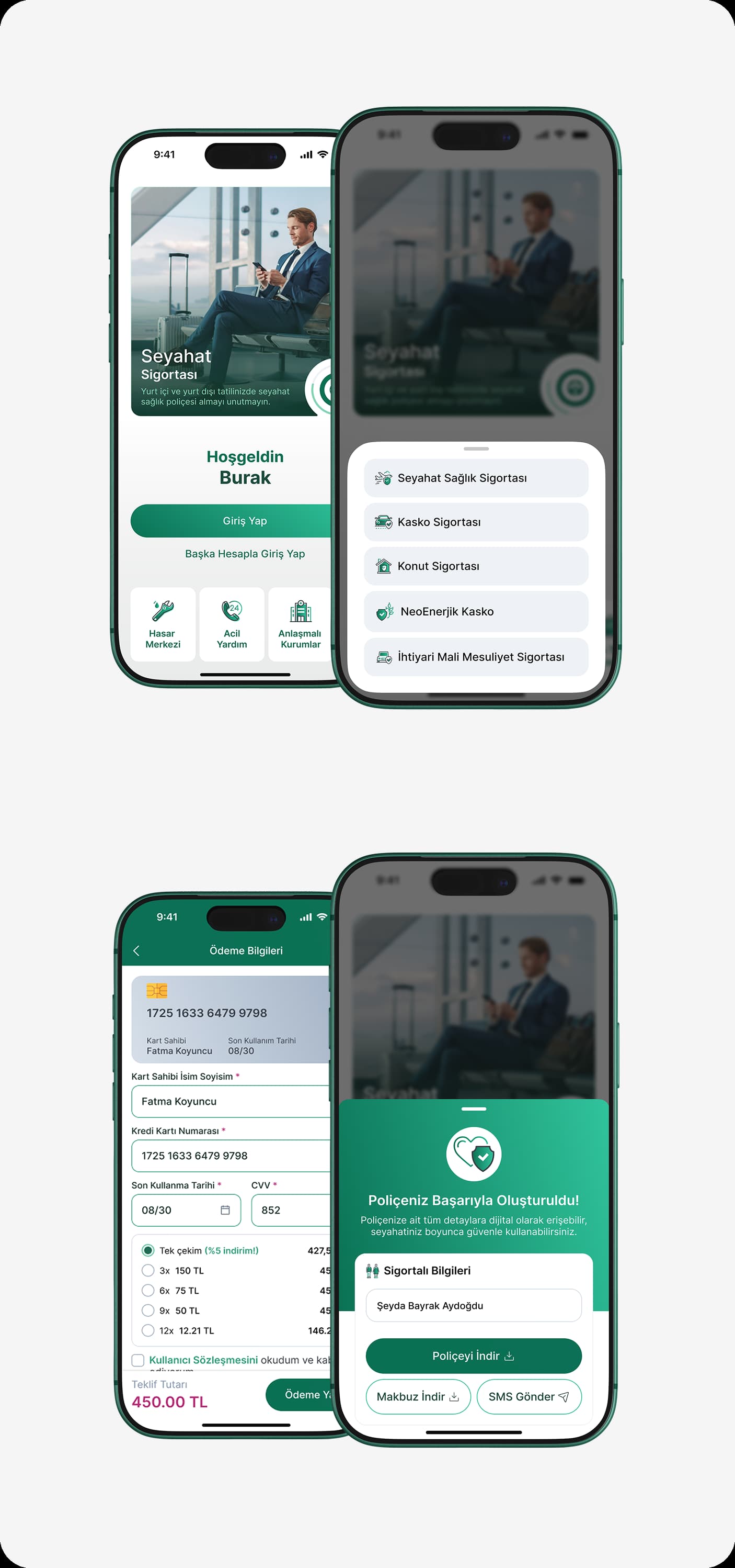
We designed a flow that engages users immediately, without requiring registration. By minimizing the distance between non-login entry and exploration and purchase, we accelerated the process, especially in urgent need situations.
With a step-by-step form structure, we broke down complex insurance processes into manageable parts, displaying only the necessary information on each screen to reduce cognitive load. We provided users with a constant sense of control through a progress bar.
With dynamic fields and smart validations, the form adapts to the user, revealing only what’s needed at the right time and keeping the experience fast and seamless.
In the summary and payment steps, we prioritised clarity and trust. While providing the user with complete visibility at the decision moment, we completed the process with a seamless and familiar flow.
As a result, we created a fast, intuitive, and low-friction purchase experience.
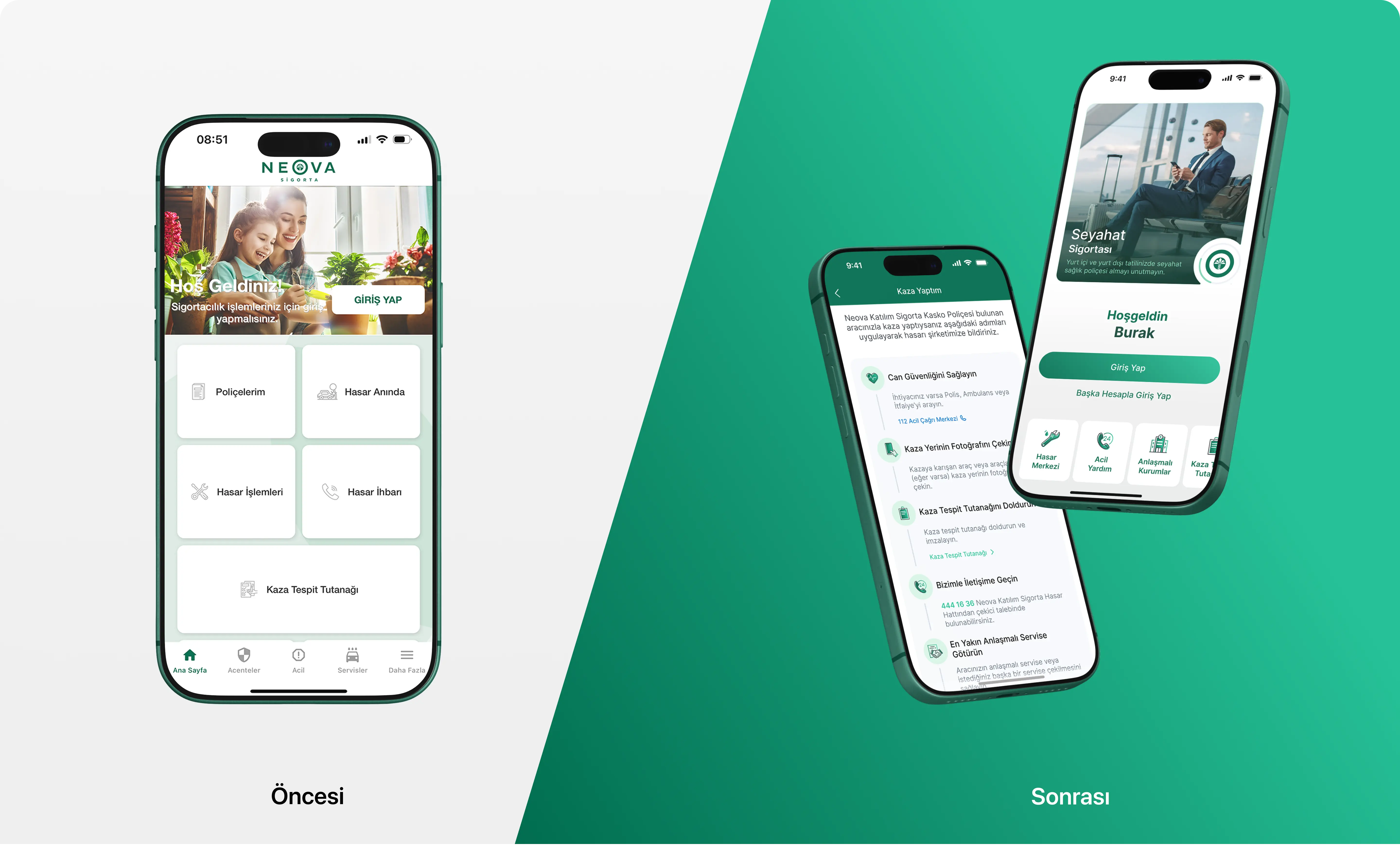
A Clearer, Smoother Mobile Insurance Experience
In the previous experience, users were struggling to reach the processes they were looking for amidst overwhelming information and scattered actions.
In the new design, we simplified the flows for claims, assistance, and products, enabling users to access the actions they need more quickly and confidently.
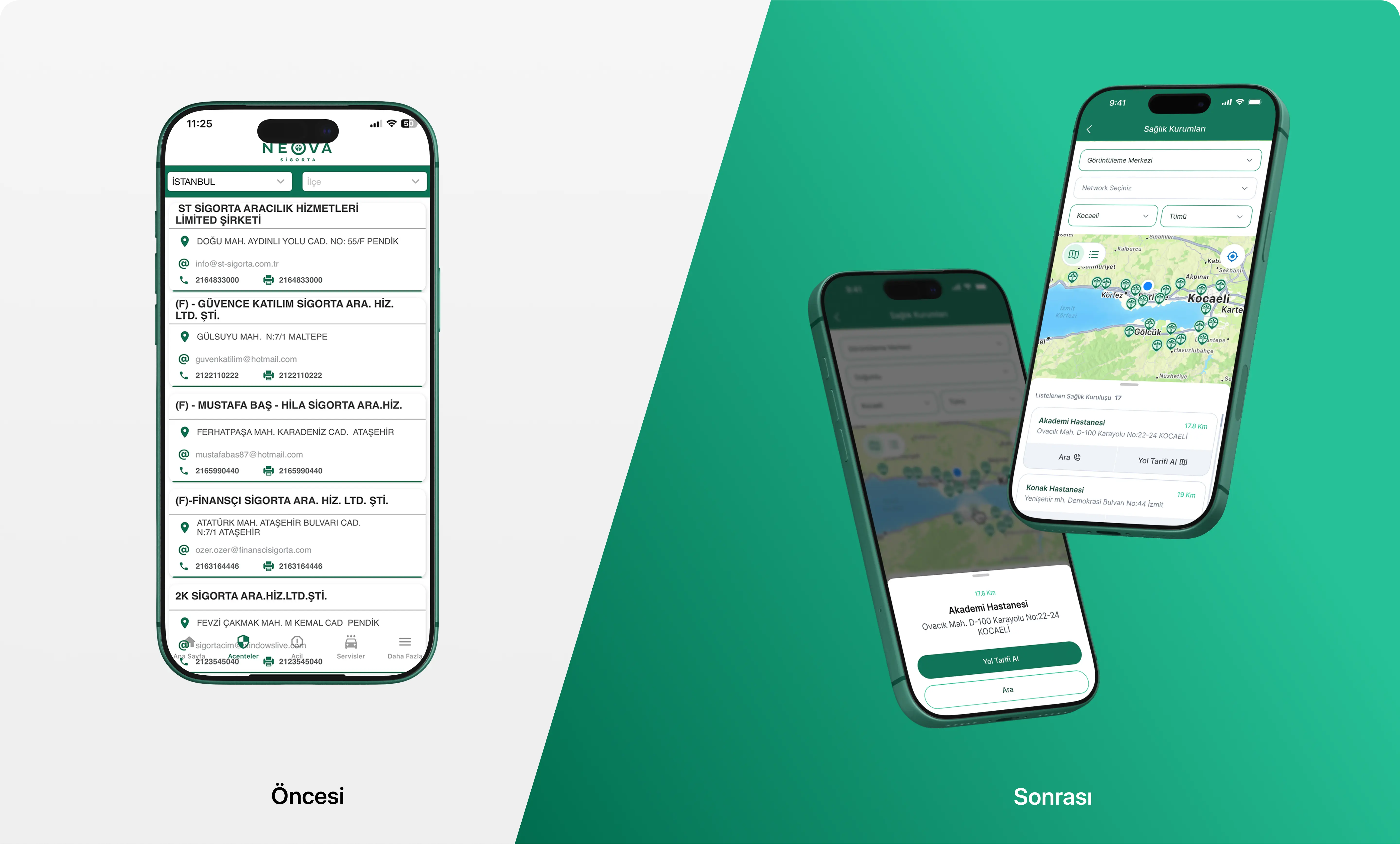
Map-Focused Experience from List Chaos
Before the redesign, health institution and service information is presented in long lists, making it difficult for users to find the correct point.
In the new design, we reduced list density and strengthened the map, filtering, and location-based guidance features. This allows users to reach the nearest and most suitable institution more quickly.
Featured Works
Explore our experience and results-driven projects.
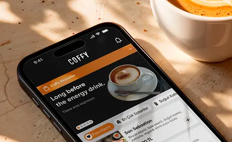
MOBILE APP / FOOD DELIVERY
Coffy is a coffee chain renowned for its high-quality beans sourced from Colombia and Ethiopia, and its unique pricing policy. Offers a diverse range of coffee and fresh food items, all available at a single price point.
View Case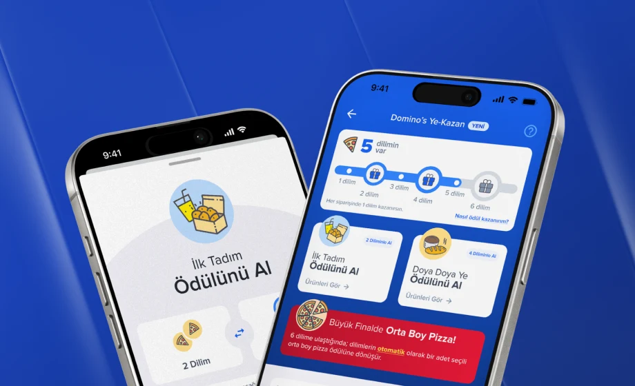
MOBILE APP / FOOD DELIVERY
As one of the world's largest pizza chains, Domino's offers its customers not only fast delivery but also attractive deals. The Ye-Kazan loyalty program enhances the ordering experience, adding extra value with every purchase.
View Case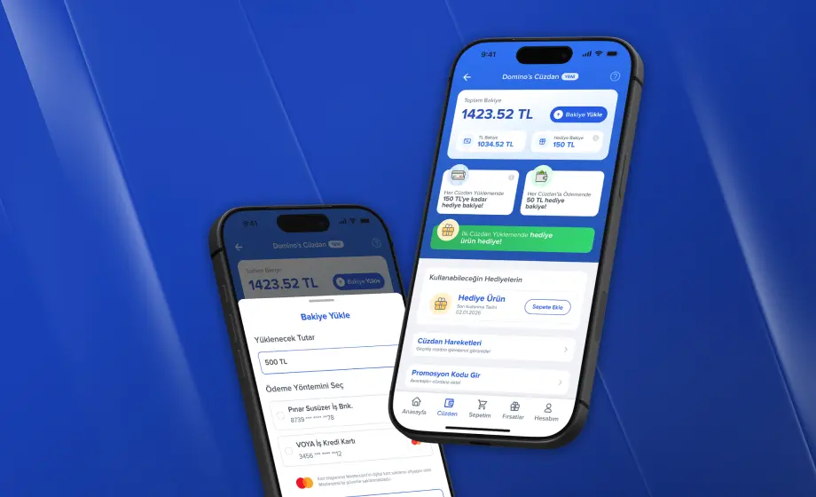
MOBILE APP
We have completely revamped the web and mobile application experience to make it easier for Domino's users to load balances, earn gift balances, and track wallet activities. With the new wallet flow, users can now manage their balances, loading histories, campaign winnings, and promotional code transactions in a clearer, more accessible, and brand-consistent experience.
View Case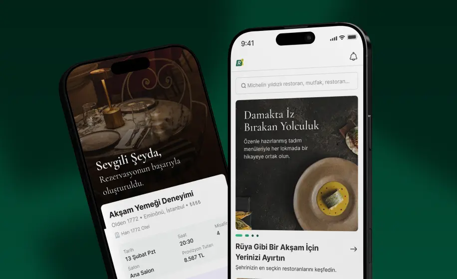
WEB APP / SAAS
Rezervem is a comprehensive digital platform designed to streamline operations and enhance user experience.
View Case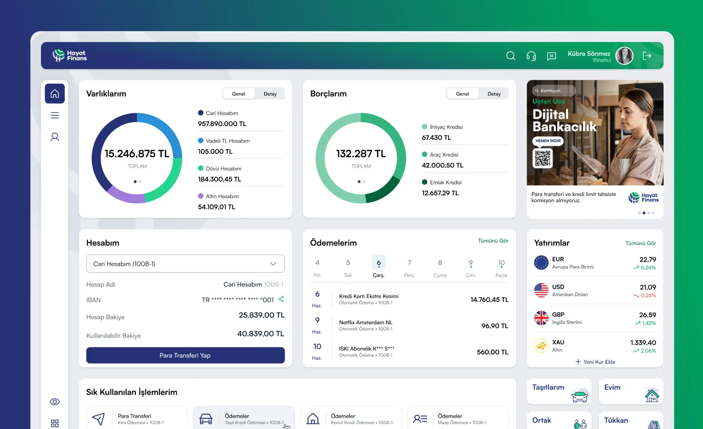
WEB APP / FINANCE
Hayat Finans enlisted our expertise to create a revolutionary internet branch, designed to offer its users round-the-clock access to banking services, enabling them to effortlessly conduct transactions at any time and from any location.
View Case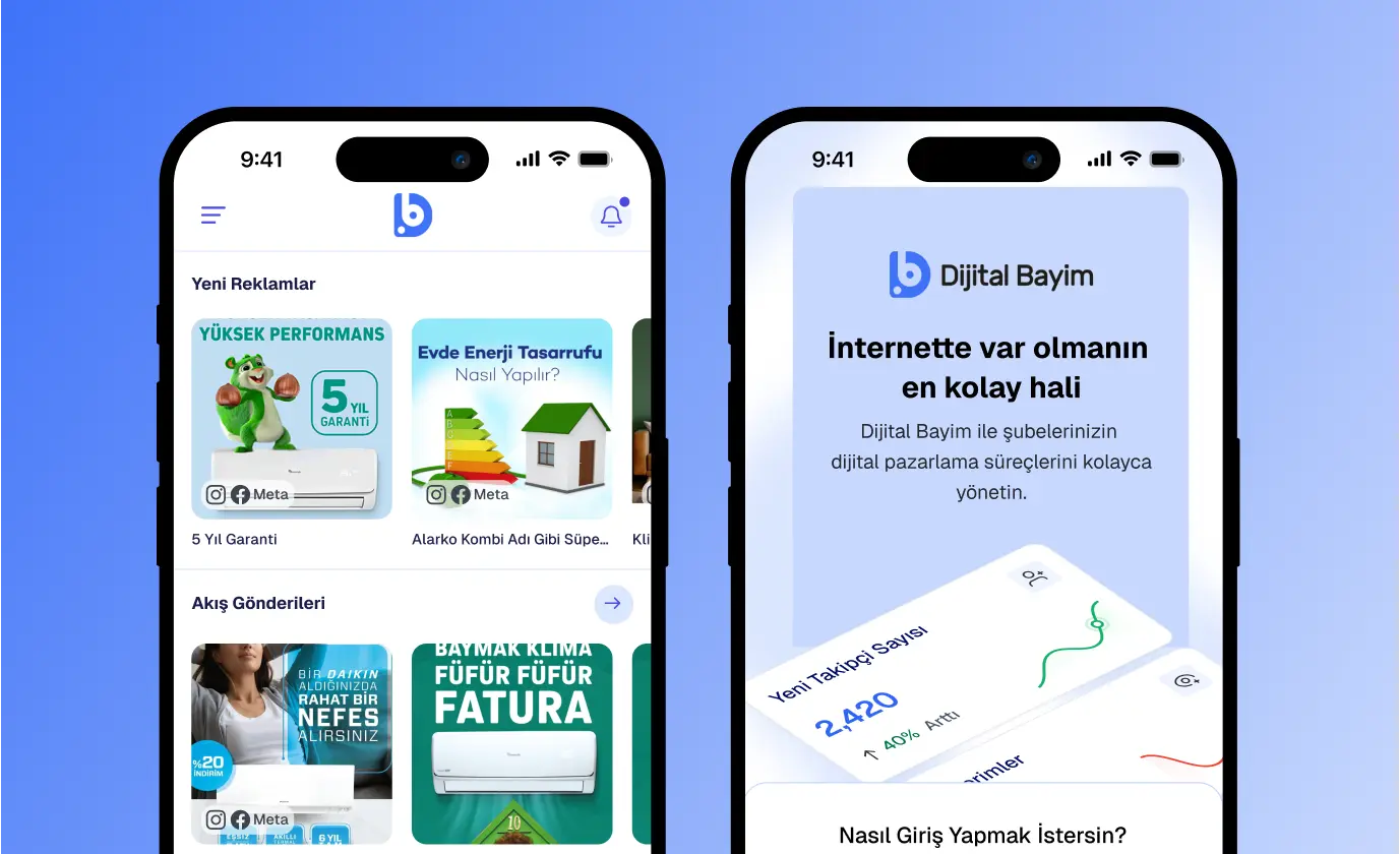
MOBILE APP / SAAS
Dijital Bayim is a digital marketing platform for businesses. Reach your target audience instantly with customized designs tailored to your brand.
View Case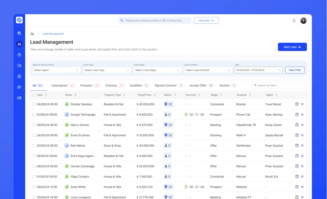
WEB & MOBILE APP / SAAS
Fizbot Sales Navigator is the sales management platform specifically designed for real estate offices. It enhances the speed and follow-up of consultants while allowing offices to seamlessly track, measure, and manage performance.
View Case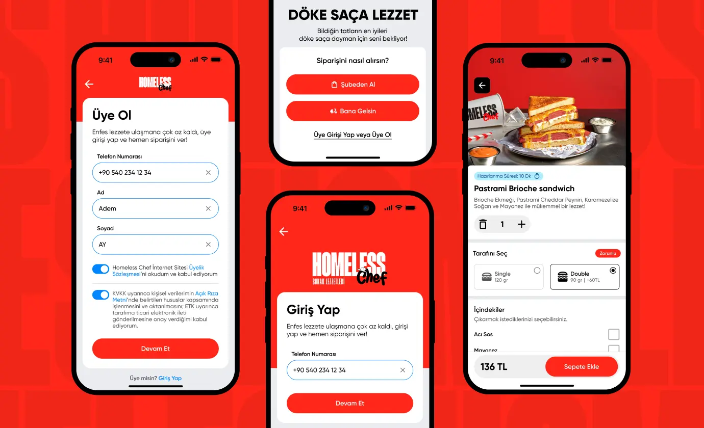
MOBILE APP / FOOD DELIVERY
Homeless Chef, located in Istanbul's lively Karaköy district, is a culinary destination where the charm of street flavors meets affordable luxury. Inspired by the bustling streets of vibrant cities, Homeless Chef offers a unique...
View Case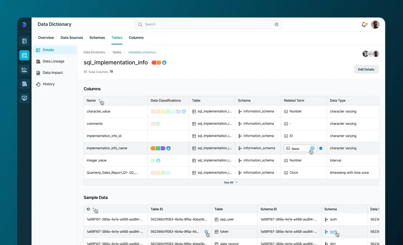
WEB APP / SAAS
Datarul is a start-up that provides data governance solutions and grows with its own resources, aiming to facilitate the data management processes.
View Case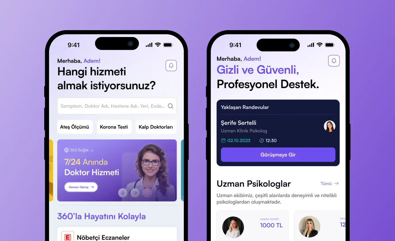
WEB - MOBILE & APP / HEALTH
360Sağlık by Doğan Holding, introducing a health platform that facilitates access to services and enables home treatment opportunities without wasting time. Our efforts extend from user research to digital designs and app development, aiming to enhance patient experiences.
View CaseReady to talk
about your project?
Do you have a clear vision regarding the ideas, goals, requirements, and desired outcomes for your project? Let's take the first step together by setting up a meeting to bring all of these to life.